
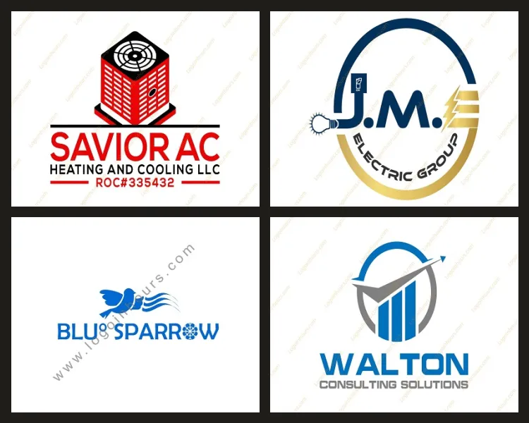
You know a great logo when you see one – but what makes it work? Behind every iconic mark are the same core principles. Use this checklist to judge your own logo or guide a redesign.
1. Simple
The best logos are easy to recognize at a glance. Simplicity makes a mark memorable and versatile.
2. Memorable
A distinctive shape or idea sticks in the mind. If people cannot recall it, it is not doing its job.
3. Timeless
Avoid chasing fads. A strong logo should still look good in ten years.
4. Versatile
It must work in one color, tiny or huge, on screen and in print. This is why vector files matter.
5. Appropriate
The style should fit the industry – a law firm and a candy shop need very different marks.
Need a Logo in Philadelphia?
Same-day custom concepts, unlimited revisions, and every file format — at no upfront charge.
6. Balanced
Good spacing and proportion make a logo feel professional and intentional.
7. Scalable
If it turns to mush as a favicon, it is too complex.
8. Original
It should not look like a competitor or a stock template. Originality builds trust.
9. Meaningful
The best marks carry a small idea about the business – a clever hint, not a literal picture of everything you do.
10. Consistent with your brand
Color, type and tone should match the rest of your identity.
Score your logo against these ten. Missing a few? Our Philadelphia designers can refine or rebuild it. Start a free consultation.